Meet our graduates
Ana Jacheva | Ana Torres Baptista Parreira | Ben Van Son | Camila Cote Zapata | Da Mee Kim | David Mares | Dennis Fechner | Evi Vannerom | Galina Golovushkina | Gijs Ipers | Inês Magno | Jane Powers | Jika Shaiymbetova | Kyo Shelfhout | Magdalena Zawieracz | Margot Hunin | Nathan Smekens| Partrick Vanvooren | Purvika Sharma | Robbe Van Molle | Sara Pejhan | Tristan Heemels | Tatyana Soubotko
#1 | Ana Jacheva
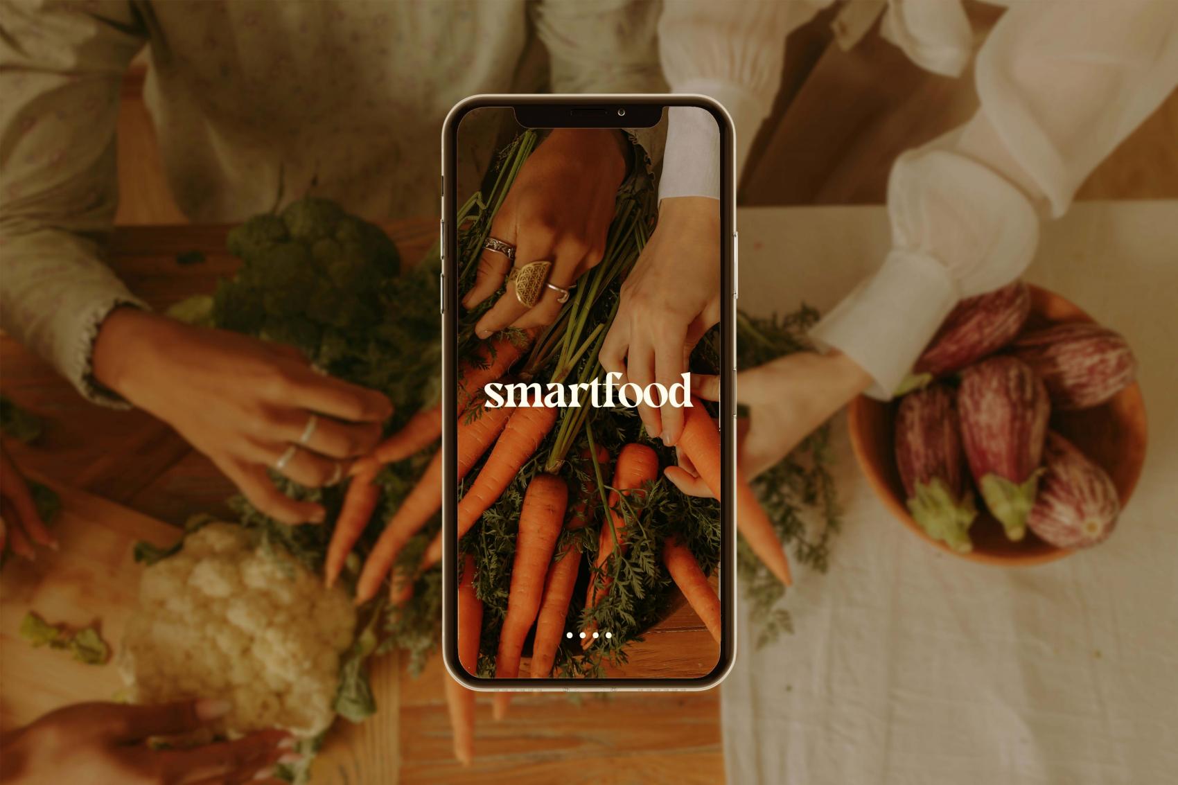
smartfood
The work titled smartfood is aimed at offering a useful digital tool (mobile app) to young people in Belgium that provides information, guidance, motivation and support for reducing household food waste. All the functionalities and benefits of smartfood are supported through a campaign conducted both online and offline, and are used to expand the network of users, thus establishing a sense of community contribution. Ana Jacheva’s work is focused on finding multidisciplinary solutions to growing societal issues, such as food waste, within the area of Design for Social Good.
Contact
Instagram @anajacheva
#2 |Ana Torres Baptista Parreira
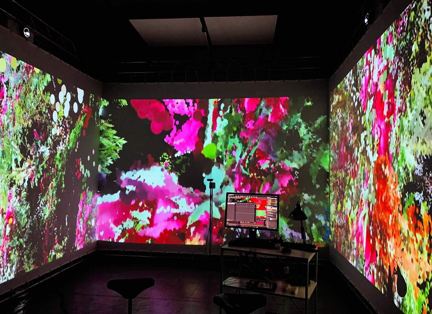
recollections: remembering nostalgia through an audiovisual installation
Textile and audio
Recollections is an audiovisual installation involving a duvet textile, spoken audio, a steel drying rack and a couple of white garden chairs.
It is about nostalgia and is meant as an open tool for conversation and (self-)reflection, with the aim to create meaningful bonds among people, and between design/data and people. The duvet is a visual mapping of items, photos and objects that have evoked a feeling of nostalgia in participants. It is made from different types of fabric and printed using a number of different techniques to enable visual and tactile stimulation. The audio supports the installation by providing a context and a story with respect to these items, which stories are told directly by participants. It is also edited in a way as to allow participants to follow up on each other, creating a connection between them. Spectators are invited to step inside the installation and are allowed to touch and replace the textile, depending on how they want to experience the installation. It is important to take time to fully experience every part of this installation.
Contact
Instagram@toobad1mnotreal
#3 | Ben Van Son
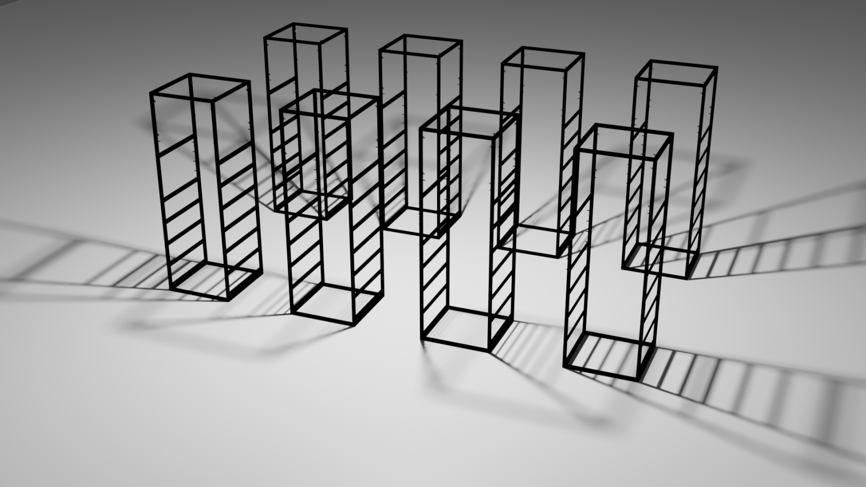
De infrastructuur van het internet!
We gebruiken internet zonder er echt bij stil te staan, laat staan dat we ons afvragen hoe het werkt. Als we wél over internet nadenken, gaat het vaak over cloud computing, een luchtig en vaag thema.
Deze visualisatie komt hiertegen in verzet. Hierin wordt onderzocht hoe internet echt in elkaar zit.
In zijn onderzoek heeft Van Son zich specifiek gericht op de infrastructuur van internet, de fysieke vorm van het digitale internet, de backbone.
Dit proces is een poging om de infrastructuur van internet te begrijpen en te visualiseren.
Deze installatie is een zoektocht naar de complexe infrastructuur van internet. In deze abstracte interpretatie van een serverkast zitten kleinere elementen die de belangrijke onderdelen van deze infrastructuur vertegenwoordigen.
(Het beeld is een prototype.)
Contact
+32 479 38 22 57
Instagram @ben_van_son
Bé Ben Van Son
#4 | Camila Cote Zapata
Unspoken words
Unspoken words is a personal journey to reconcile the relationship of humans with tears. The idea was to explore the functions of tears in detail, apart from their biological function, as “emotional crying” can only be completely understood through art and culture, and remains a mystery to the scientific community. The initial idea was that tears are a sign of weakness and lack of control over what a person is feeling, or a resource that the body can use when words are inadequate. But in the end, they appeared to be much more than that. Moreover, we were curious to know whether people cry for the same reasons, for example sadness, frustration or extreme happiness, or indeed for other reasons besides nostalgia and grief.
The idea of this immersive installation is to display the animated microscopic images of different types of tears taken and modified from The Topography of Tears, a work made by the American artist Rose-Lynn Fisher, and to allow the visitors to fill their symbolic tears (the ones they haven’t wept) or to appreciate the ones they have wept, and write down their own reasons for crying, while exploring the different answers from other people.
Contact
camila.cotez22@gmail.com
behance.net/camilacote
Instagram @camilacz22
#5 | Da Mee Kim
Spatial memory (1986-on going)
Digital images, sounds, memories
Spatial memory is a form of memory that is responsible for recording and recovering information needed to plan a route to a certain location and for recalling the location of an object or the occurrence of an event.
Information designers collect, structure and convert raw data into usable information, which can then be visualised so that it can be interpreted. This art collection is the exploitation of spatial memory data that has been collected, treated and visualized digitally using point cloud technology.
Join me on this visual journey and let’s celebrate some of the most beautiful and striking memories. Discover or create your own relationship within this exploration and digital exploration of neural art.
Contact
redpigflower.com
Instagram @redpigflower @nonfungiblememory
#6 | David Mares
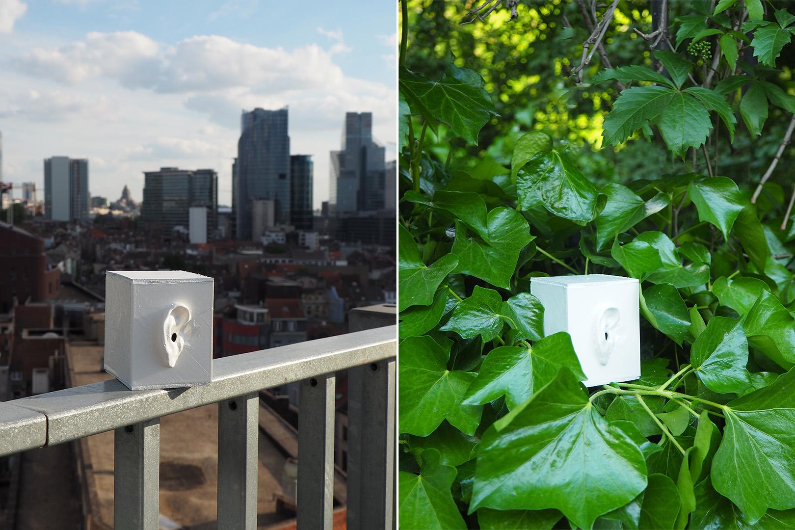
Presence in Distance
What constitutes the feeling of presence in a mediated environment? How do we experience the concept of distance and the idea of existing in multiple locations at once by teleporting receiving parts of our senses trough means of technology and outsourcing our presence?
This work consists of two stand-alone microphone-equipped sculptural stations, in the form of 3D printed scans of the artist’s left and right ear, that stream live ambient sounds from two distant locations in two distant countries. The live streams are then arranged such that they can be listened to simultaneously trough headphones, transmitting one live stream via one of the headphones and the second one via the other, thus providing an unorthodox immersive listening experience.
Due to the nature of our listening habits, the listener will be prompted to conjure a sense of spatial connection between two distinct and distant sound spaces. It is expected that the listener, encouraged by the context of the project, will contemplate about the spatial connection between these two sound locations, and experience this as the concept of “hearing distance”.
Contact
davidmares.w@gmail.com
Instagram@_david_mares_
#7 | Dennis Fechner
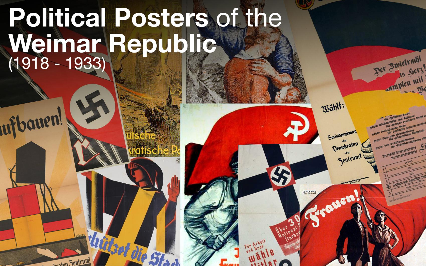
Political Posters of the Weimar Republic (1918 – 1933)
Book
160mm x 240mm
In this book, you can find more than 140 political posters of the Weimar Republic which were published between 1918 and 1933 – a restless time in German history between the First World War and the dictatorship of Adolf Hitler.
This archive not only provides images of posters of 12 parties, but also more detailed information about them, general information about the Weimar Republic and other useful data. Moreover, a better understanding of used information and misinformation in political communication during this period was developed by categorizing and analyzing these publications.
Contact
Instagram @dennis_fechner
#8 | Evi Vannerom
Brussels Creatives
Brussels Creatives is an online community where creatives can share their projects, advice and knowledge, as well as organize events where members can come together to create and collaborate. It is a reaction against the growing popularity of cheap, low-quality and mass-produced furniture, and is aimed at encouraging people to make more durable, unique and original objects, and buy less. As an example of how the community could work, three pieces of furniture were made, inspired by the Akari Light Sculptures by Isamu Noguchi, the Chidori Furniture by KKAA, and the CH25 Lounge Chair by Hans Wegner. Each project is featured on the website and has its own tutorial. One is an illustrative manual, another is a video report, and the third is a blog post with explanatory images.
Contact
#9 | Galina Golovushkina
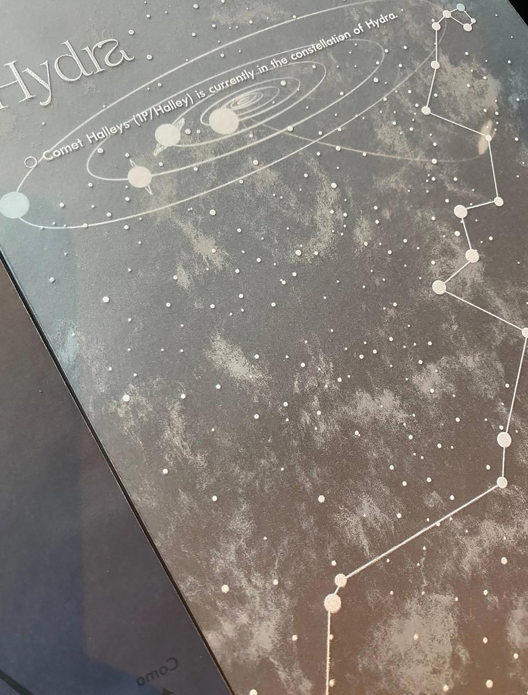
Atlas of comets and their trajectories
Paper, tracing paper, transparent plastic paper
Comets have always left a deep imprint on humanity’s perception. Comet-like images have been found engraved on ancient stones of various civilizations. People have been terrified and thought comets were pure evil. Other people thought that such celestial bodies are conductors of the sky. Every year, 5-7 new comets are discovered and quite often, once every 2-3 years, a bright comet with a large tail whizzes past Earth. For the author, comets are not a scientific subject, but rather a beautiful cosmic phenomenon laden with romance and mystery.
The goal of this work is to combine the vastness of space with book design, which is less vast because of technical limitations. Nevertheless, the author wanted to do something unusual that would force people to immerse themselves in the theme of space and interact with the book. For the designer, a book is, first and foremost, an art object. Transparent pages play a key role in the interaction with the book. Overlaying effects create an image of the vast expanse of space, making the static medium an immersive object as the information overlays one on another.
Contact
+32 491 93 20 18
Instagram @galyagolovushkina
#10| Gijs Ipers
The New Literacy
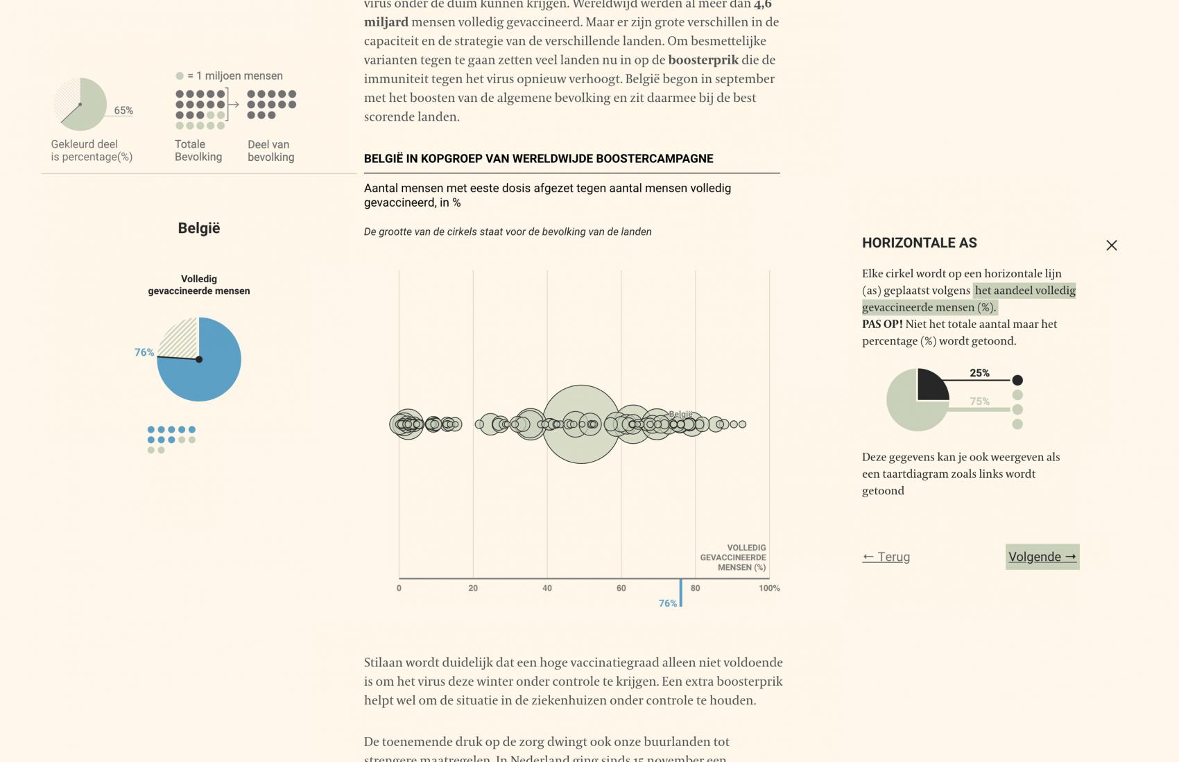
Data visualization has existed for a long time, but not until recently have people started to use it to communicate with a wide audience. The problem is that people are often unable to understand the visualizations they see in the news. For this reason, Gijs Ipers developed a step-by-step guide that helps users read and interpret data visualizations they see in online articles. This step-by-step guide is aimed at users who are unfamiliar with the somewhat complex visualization that the guide is accompanying. The guide takes the user through the steps of deciphering the visual encodings that the graph is composed of, and provides insights into statistical concepts present in the visualization. The main goal is to provide users with an understanding of the specific visualization type, while, at the same time, improving their data visualization literacy. With this project we hopefully take a step closer to a visualization literate world.
Contact
Instagram @gijsipers
#11 | Inês Magno
Visualising Anxiety: Through the uniqueness of each individual
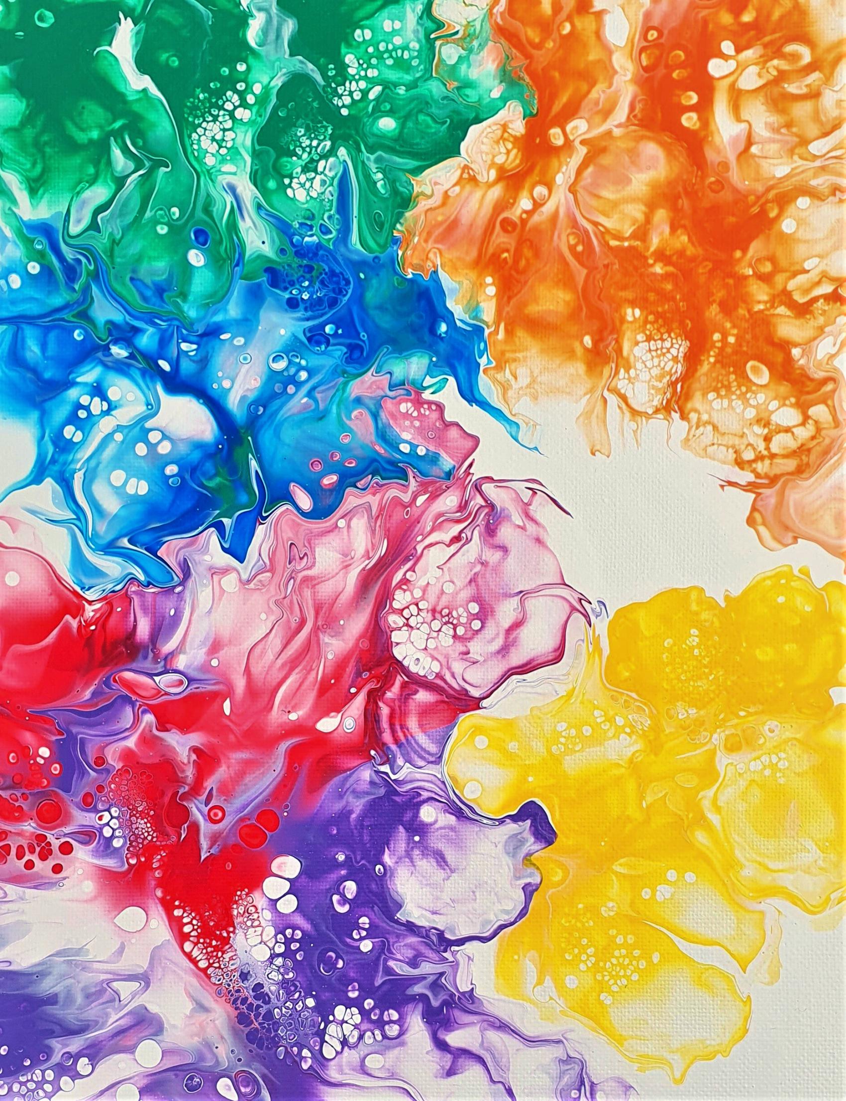
Anxiety is among the most common mental conditions in the world, and artists have represented it in their works for a long time. There is a tendency to visualize this condition as a voracious monster. This master project takes a different approach. It visualizes the clinical symptoms of generalized anxiety disorder and demonstrates how the same disorder can be experienced differently from one person to another. Since everyone has their unique background, will their experience be unique as well?
For this work, data was collected from a group of people diagnosed with anxiety, and then translated into an abstract image using Acrylic Pouring. The project ended in a book and invites people to reflect on anxiety in a different way, away from the despicable perspective and negative emotions.
Contact
+351 912616022
behance.net/inesmagno
Instagram @byinesmagno
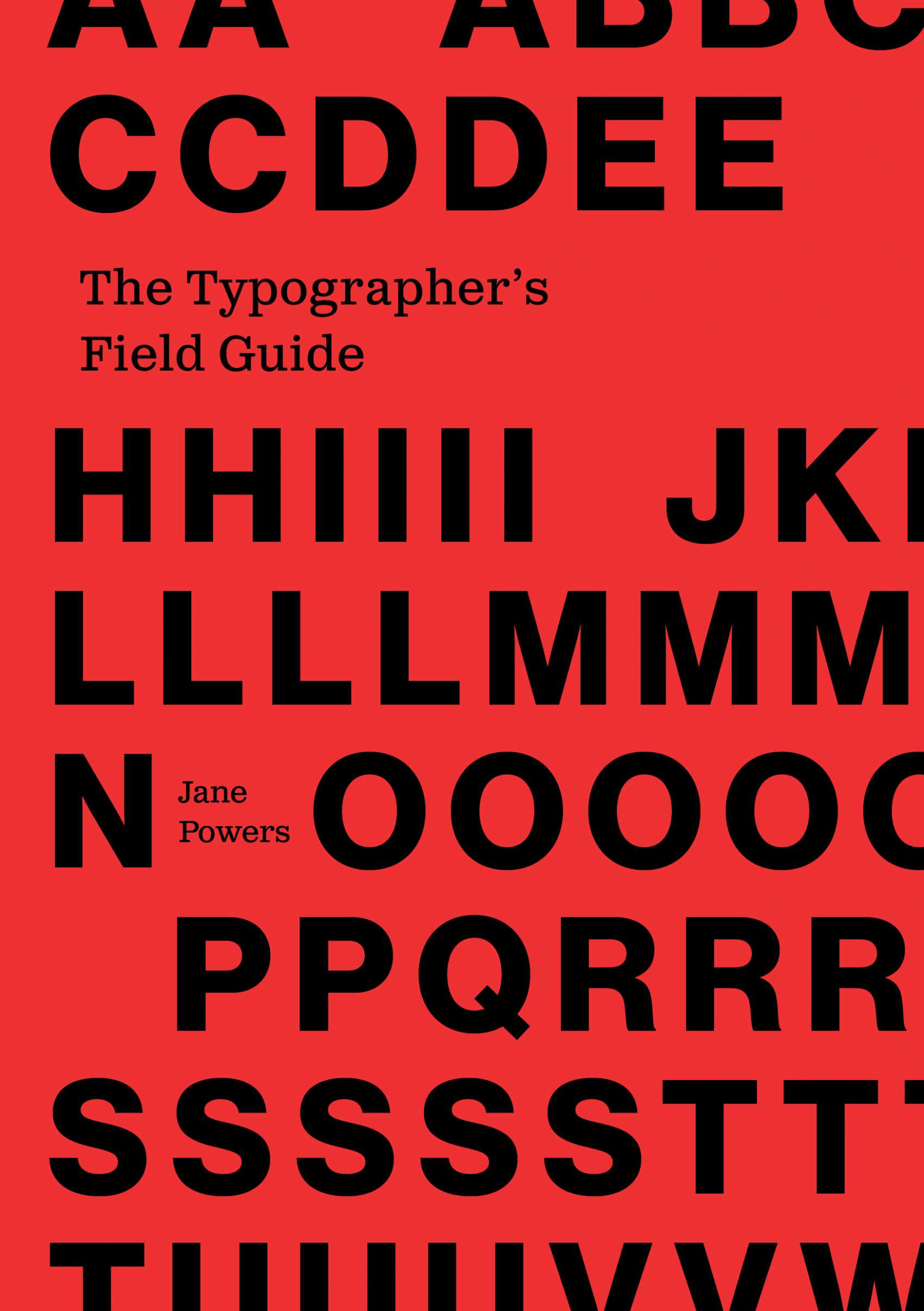
#12 | Jane Powers
The Typographer’s Field Guide
The Field Guide to Typography is a tool for novice designers to navigate type. Each user has the freedom to find their own samples of text, and can use the guide to identify typefaces which engage and interest them. The use of the field guide will allow a designer to grasp the ins and outs of typography, connect with the personality of different typefaces, and understand type’s role in design as a whole. The booklet can be taken along with the user and can be fully integrated into and tailored to the user’s design journey.
Contact
Janepowersdesigns.com
#13 | Jika Shaiymbetova
Growth
The present trends of growth, in terms of world population, pollution, urbanization, food production and resource depletion persist, despite all the efforts taken. We live in cities, we consume energy, we drive cars, we use electricity and public transport, but we rarely think about the production sites where this energy comes from. This study focuses on the hidden impact of our everyday energy consumption. It reflects on awareness and tries to make the subject relatable; the less we are aware of the impact we make, the closer we get to the point that we stop caring. This three-dimensional representation of data using a sculptural volume is an attempt to give an idea of the volume of our daily energy consumption.
Contact
jikaworks.com
Instagram@blackbird_99
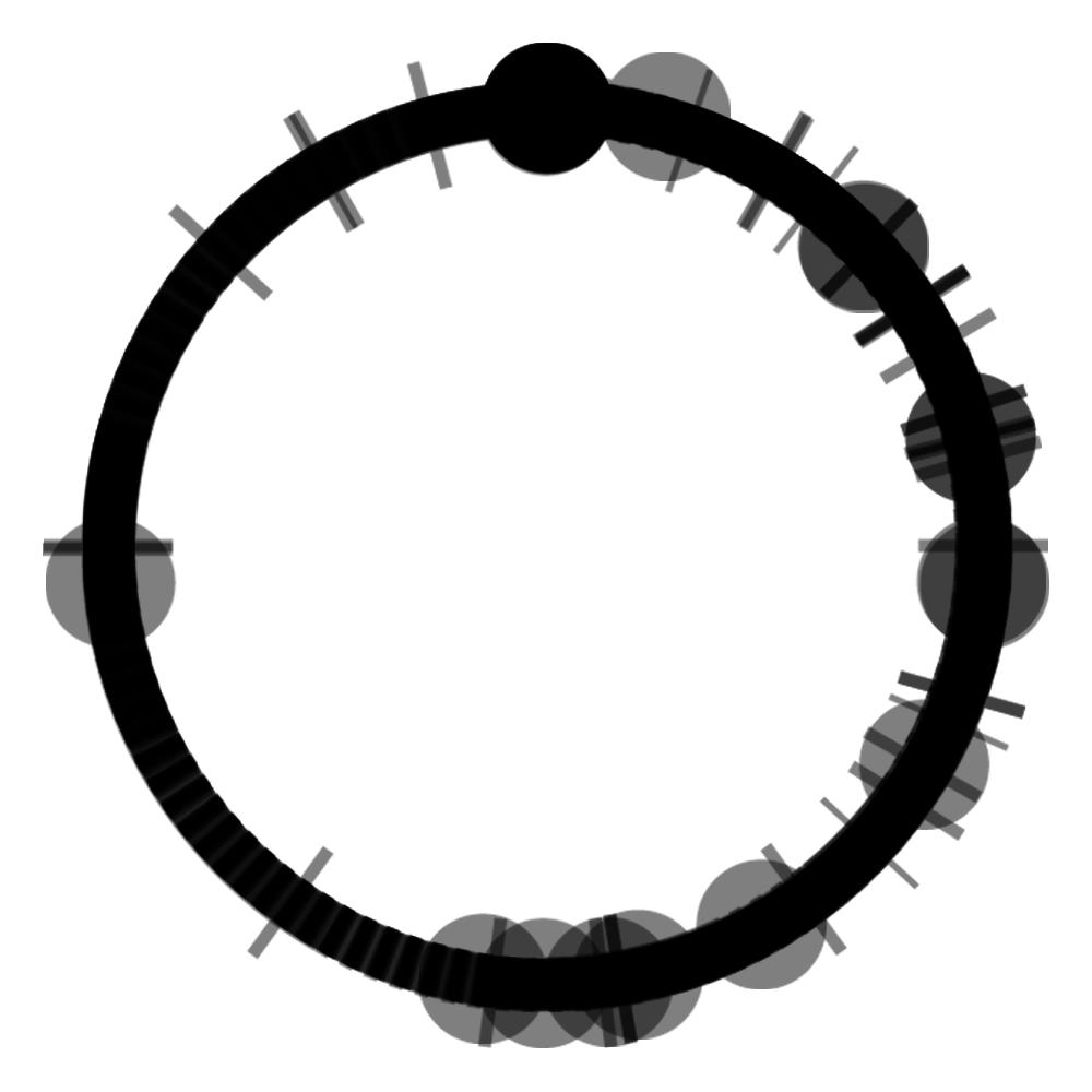
#14 | Kyo Schelfhout
Goal
Textile, Digital work
100cm x 150cm
Goal is a visualisation featuring all the goals made in the last 9 world cup finals. It shows the actions leading up to the goal. The website tries to make football data accessible by being interactive.
Kyo Schelfhout (1999) is a Belgian designer who likes to combine design and coding in his works. His two main passions are data and football, and in this work he has combined them.
Contact
#15 | Magdalena Zawieracz
Slogans of Care
Slogans of Care is a two-part project exploring activism and alternative modes of resistance. The book is designed to leave space for participation, for something to be revealed, scribbled or torn out. Its goal is to showcase different views of activism-related practices. The second component of the work, the very slogans, added Magdalena’s own voice to that of others. The statements, screen-printed on silk, were imagined as a personal manifesto, a handful of not-so-rigid rules on how to disobey, make and design. Collectively, they translate what the artist has learned from conversations on activism and private experiences. Slogans wishes to facilitate an open dialogue and invite the reader to consider smaller, softer interventions. They are to project a sentiment - resist through care.
Contact
Instagram@magdalenazaw
#16 | Margot Hunin
Visualizing scars through data
2m²
Visualising scars through data is a data visualization about the visible and invisible stories behind scars. Data visualization of scars in textile initiates a conversation and creates a space to talk about data and physical trauma. By collecting, visualizing and physically representing personal data, we can link data back to its original source, the human being.
This design aims to shift the focus from data to a more humanistic source of information. By putting people at the centre of data, our empathic, imperfect and human qualities can be reflected in a data collection. The design is a blanket that makes scars and trauma discussible in an approachable way, while, at the same time, offering comfort in the form of an embrace. The blanket is a map of scars, based on the appearance, story and emotional impact behind the scars. The visualization of data in textile disguises the cold that numeric data are associated with, and wraps them into a warm blanket.
Margot Hunin is an interior, furniture, media & information designer inspired by visualizing invisible stories.
Contact:
Instagram @margothunin
#17 | Nathan Smekens
Spice
The aim of this master thesis’ product was to broaden the knowledge about herbs and spices, thereby boosting the motivation for the usage of these in the garden and kitchen. The end result is a cabinet consisting of a variety of herbs, spices and seeds the user gets ready to use on a day to day basis. On the backside of the cabinet slideable panels hide a wide array of information about herbs and spices such as: how to determinate a herb or spice, how to use herbs and spices in the kitchen, a short history, spice blends, medicinal and nutritional properties and how to grow and maintain herbs in the garden. Combining all these elements in a graphically pleasing end result.
Contact
Instagram @n8wip
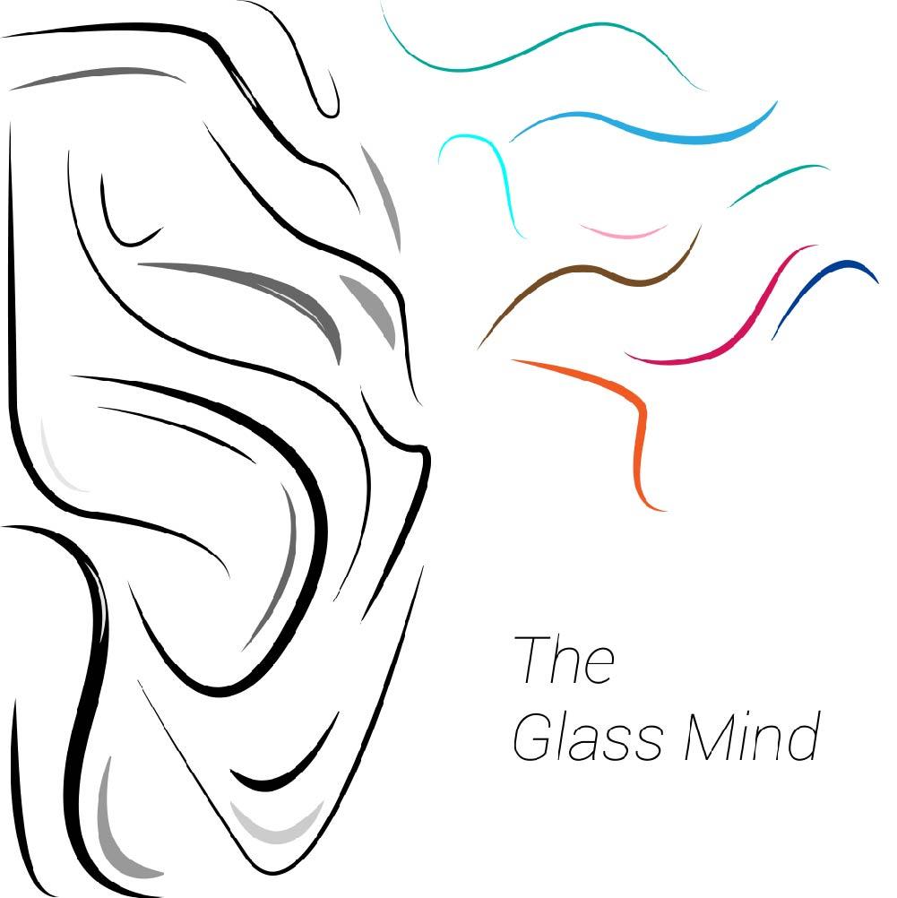
#18 | Patrick Vanvooren
The Glass Mind
The Glass Mind is an expo installation that adds an informative and visual element to philosophy and psychology. Using a glass sculpture and user connected lighting, it displays an information flow that can be processed by the brain through different sensory impacts. Using a Sweezee interface, the user can change the level of impact on the labelled senses, which generates different lighting effects.
Contact
Instagram @designerpat
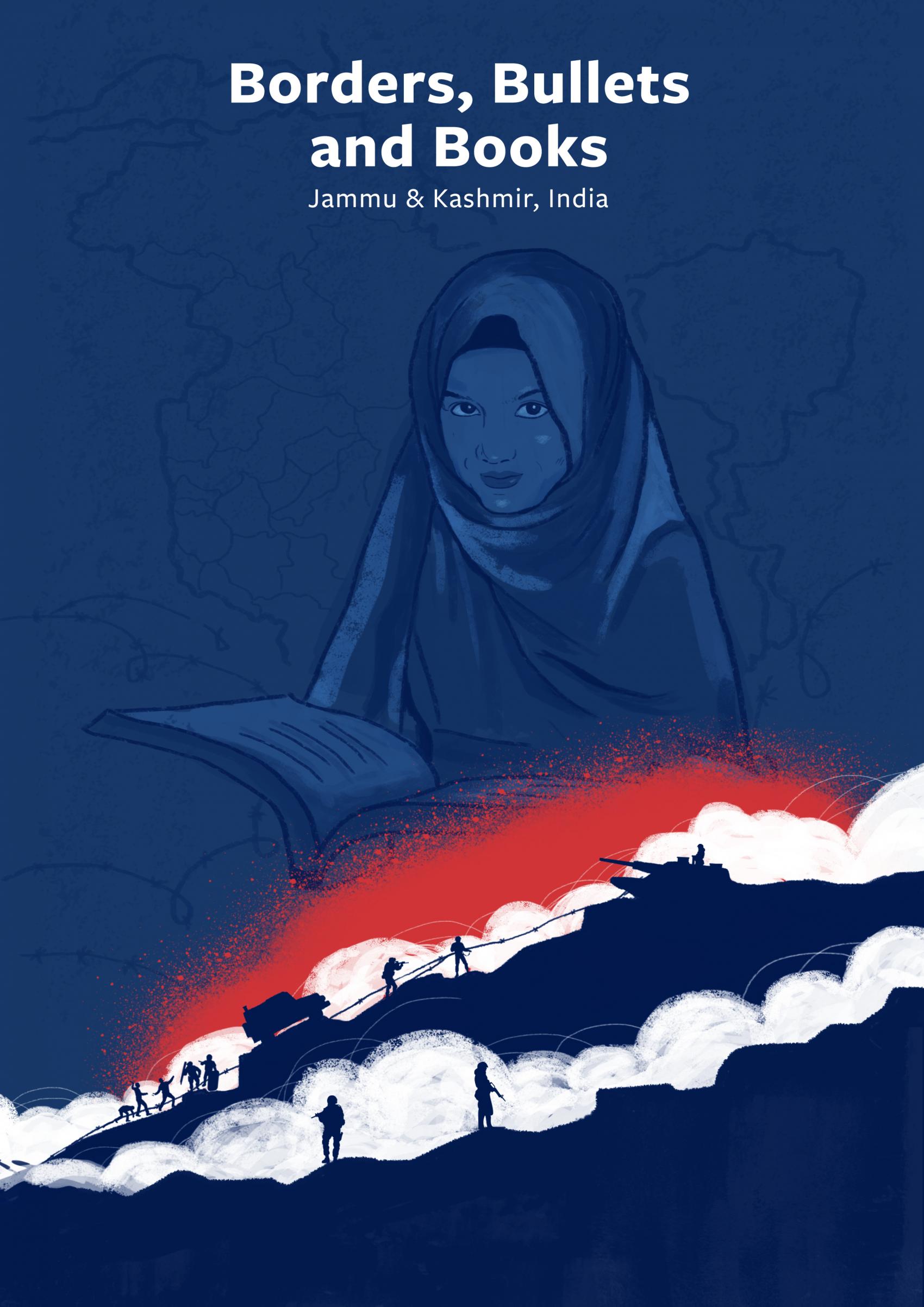
#19 | Purvika Sharma
Visual Narrative on the Impact of Conflict on Education in Jammu and Kashmir (1999-2019)
Digital work
The picturesque Kashmir valley in the western Himalayas has witnessed decades of conflict and unrest since the independence of India and Pakistan in 1947. Kashmir, with its complex history, is claimed by both countries and has been the scene of several wars. Whole generations in Kashmir have grown up surrounded by violence, in a heavily militarized area.
When talking about conflicts, we often focus on casualties, migration and economic loss. However, education is a silent victim of conflict, with far-reaching consequences. Education is generally the first to get disrupted by conflicts, but this receives little attention.
This web-based visual narrative represents the impact of conflict on education. It aims at creating awareness of the prolonged conflict in Jammu and Kashmir (J&K).
Contact
#20 | Robbe Van Molle
Patronen herkennen in nieuws.
Is nieuws voorspelbaar? Is er een zeker patroon in te herkennen? Zijn er ‘nieuwsluwe’ momenten? Of is de stroom van nieuwsfeiten zo groot dat je, als het ware, door de bomen het bos niet meer ziet? Zijn er nieuwsonderwerpen die steeds terugkeren? Zijn die onderwerpen gekoppeld aan een bepaalde periode in het jaar? Dit zijn enkele van de vragen die Robbe Van Molle (1998) als “nieuwsjunkie” bezighielden. Robbe, student aan de LUCA School of Arts, Campus Sint-Lukas in Brussel, presenteert zijn digitale werk op een 4K-televisiescherm van 55 inch. In zijn werk verduidelijkt hij hoe zijn data, verkregen via het scrapen van VTR-NWS-nieuwsfeiten, worden verwerkt. Dit is de basis voor zijn scrollytelling, met als ultiem resultaat de voorspelling van het volgende nieuwsfeit.
Contact
0499 32 31 46
Instagram @fixy_design
#21 | Sara Pejhan
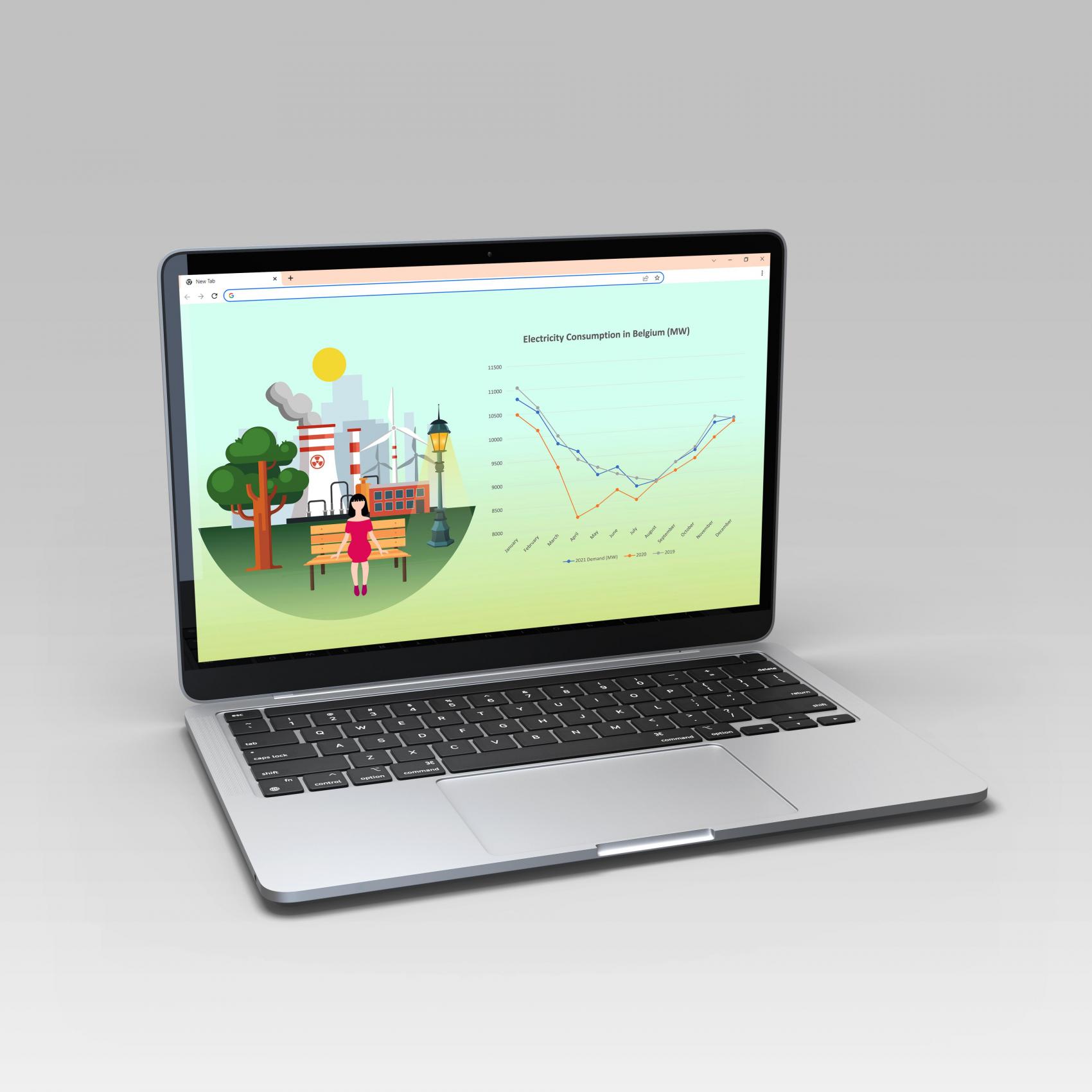
An Interactive Visualizing Electricity Data in Belgium (in COVID-19 years)
Digital work
In the last two years, energy and COVID-19 have received a lot of attention. This project aims at demonstrating how electricity consumption and the price of electricity have changed in Belgium in the COVID-19 era. Data from three years - 2019, 2020, and 2021 - has been analysed to see if there were any differences. The obtained data can, of course, be presented in a simple table or line graph, but we wondered whether it would also be possible to present them in an engaging way that is more attractive to the audience.
For this purpose, storytelling, interactive website design was developed to help make the concept more memorable and to facilitate more engagement with the audience.
Contact
Instagram @sara.p.gallery
#22 | Tatyana Soubotko
ITSUMO
ITSUMO is a collection based on a research into the aesthetic, artistic and social significance of the kimono in Japanese history, from the 16th century until the creativity of contemporary fashion now.
Based on a combination of the rich history of the kimono and aspects of the Japanese and American culture, elements from the past and present have been assessed and filtered. With the deconstruction and reconstruction of traditions, and by combining old and new techniques, the kimono is reanimated with a sense of modernity and a cross-cultural appeal. Using clean designs, this collection presents a story about issues that are topical in Japan. The collection ITSUMO relies on a strong and important sentence “Less is more”, an aspect that we see in all of Soubotko’s works.
Contact
instagram @sbtk_tatyana @tatyanasoubotko
#23 | Tristan Heemels
Visualising the invisible: a designed interpretation of the synesthetic experience.
Synæsthesia is a condition in which someone perceives things through their senses in an unusual way. For example, a color is experienced as a sound, or a number as a position in space. It is a condition with profound implications.
A panoramic visualization on the principles of synæsthesia is designed using virtual reality. The spectator dives into a virtual landscape, where they experience cross-modal visualisations firsthand.
Contact

#WeArt